Visualizing Projects With NDepend
As a consultant, I am frequently working in new code bases. Sometimes they are quite large and have existed for many years. In these cases, it is important to get a feel for how the project is structured. It is important to understand where the important parts of the code are. NDepend is a tool that helps developers understand what is going on in a code base. It provides graphical summaries of the structure of the code. In this blog post, I want to see what I can learn about a few projects, just by using NDepend. (In the interest of full disclosure, Patrick did give me a license. )
I want to start by analyzing a simple project. So I am going to look at the Nintaco proxy code. I opened the project in Visual Studio and attached NDepend to the project. I immediately got a report on the state of the project. It told me that there were 999 lines of code (in the green box below). It told me that it only has one dependency, .Net Standard.
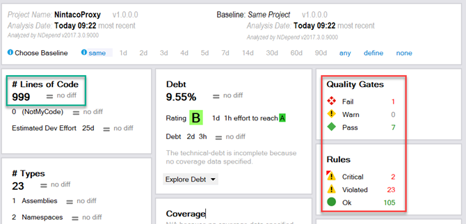
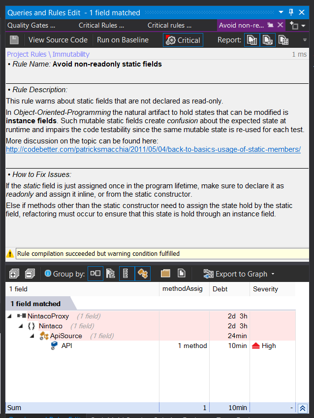
What caught my eye was the 1 Quality Gate fail and the 2 Critical Rule violations. The Quality Gate failure is referring to the Rule violations. By clicking on the rule violations, I am immediately given more details on what rules failed and were the offending code is located. There is an impressive amount of detail about the error, where it is, how to fix it, and where to get more information.
There are a lot of metrics on the dashboard that can show how the quality of the code is trending over time. They seem really valuable. But because I have just attached NDepend to the project, those metrics don’t have much to show right now. I’ll have to revisit them in a future blog post.
One of the most useful tools in NDepend is the Code Metrics view. It shows each method in the module as a rectangle. The size and color are determined my metrics that you can select. By default, the size is determined the number of lines of code and the color is determined by the cyclomatic complexity. In the default view for the Nintaco Proxy, you can see that there are a huge number of methods that are approximately the same size and complexity. This makes sense because its chief responsibility is proxy method calls to a server. Each method call takes about the same amount of work to call the proxy.
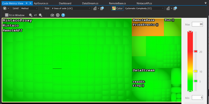
But at a glance, you can see that there is one method, ProbeEvents, that is more complex than the others. This makes it a prime candidate for refactoring or for some unit tests. This is the beauty of NDepend, it makes valuable information about your code base available at a glance.
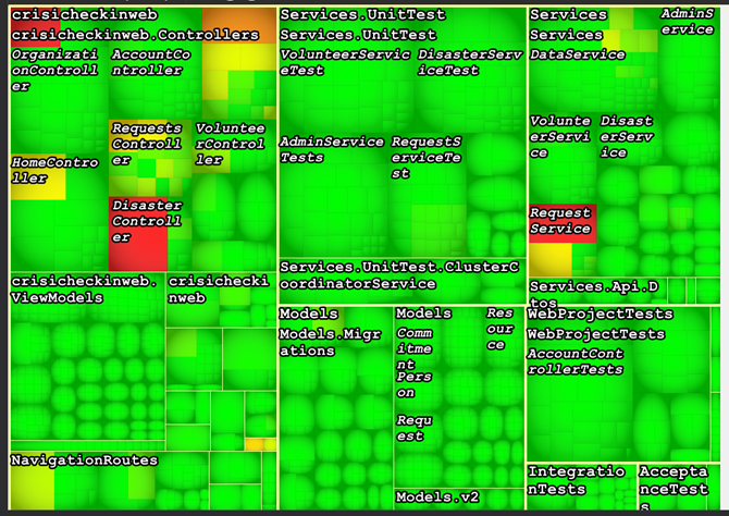
Analyzing a Larger Project
In order to exercise the dependency graph, I wanted to analyze a larger project. I chose to look at the Crisis Checkin project by Humanitarian Toolbox. This is what the Dependency Graph looks like:
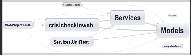
With a quick glance at this image, you can start to see how the project is architected. It clearly has a traditional 3 tier architecture. You are also seeing something about the relative size of the different assemblies based on the size of the boxes. The line thickness is telling you how many members in one assembly depend on a member of the other assembly.
What you are not seeing is that the graph is totally configurable. We could make the shape sizes dependant Cyclomatic Complexity instead of lines of code. The other amazing thing is that everything in this graph is clickable. You can click on any item to get more information or to go to the code. Clickability and configurability are very common in all of the NDepend graphs.
Again the Code Metrics view provides an easy view of the complexity of the project.
Having the Right Map
Where I am from in Indiana, the only kind of map you would ever need is a roadmap. There is almost no terrain to speak of. So if you see from the roadmap that the trip is 60 miles, you know what kind of trip you are in for. But if you live in the mountains, this might not be the case. The distance only tells half the story. You also need to know about the terrain. In these cases, it is helpful to have a topographic map, one that tells you what kind of terrain you will be driving in.
I feel like NDepend gives you topographic maps of your projects. The solution explorer is like a roadmap that tells you where things are. The graphs in NDepend tell you much more about the terrain of the project. It can tell you which parts will be steep when you need to make a change.
There are a lot of other great features in NDepend that I haven’t covered here. I’ll come back to them in future blog posts. For now, I’m having a lot of fun using NDepend to explore my projects.
Comments Section
Feel free to comment on the post but keep it clean and on topic.
comments powered by DisqusAbout Me
 My name is Eric Potter. I have an amazing wife and 5 wonderful children. I am a Microsoft MVP for Developer Tools and Technologies, the Director of Technical Education for Sweetwater in Ft. Wayne Indiana, and an adjunct professor for Indiana Tech. I am a humble toolsmith.

pottereric.github.com